欢迎访问诺维之舟医学科研平台,我们的课程比丁香园更香!
Language: 


时间:2024-09-01 17:52:04 阅读:143

诺维医学科研官网:https://www.newboat.top 我们的课程比丁香园更香!
Bilibili:文章对应的讲解视频在此。熊大学习社 https://space.bilibili.com/475774512
微信公众号|Bilibili|抖音|小红书|知乎|全网同名:熊大学习社
医学资源网站,https://med.newboat.top/ ,内有医学离线数据库、数据提取、科研神器等高质量资料库
课程相关资料:
(1)课程资料包括[DAY1]SCI论文复现全部代码-基于R、PostgreSql/Navicat等软件、SQL常用命令与批处理脚本、讲义;[Day2]MIMIC IV常见数据提取代码-基于sql、数据清洗-基于R讲义;[Day3] 复现论文、复现代码、复现数据、学习资料、讲义[Day4]扩展学习资料和相关源码等。关注公众号“熊大学习社”,回复“mimic01”,获取全部4天MIMIC复现课程资料链接。
(2)医学公共数据数据库学习训练营已开班,论文指导精英班学员可获取推荐审稿人信息,欢迎咨询课程助理!
(3)关注熊大学习社。您的一键三连是我最大的动力。
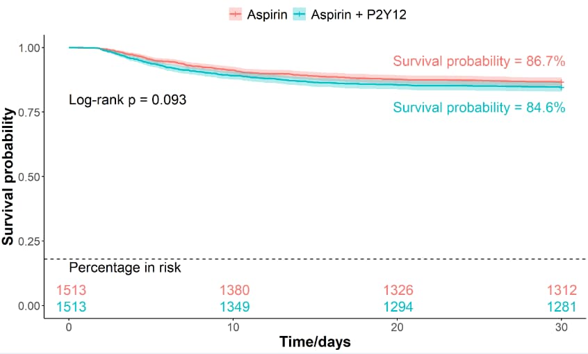
# 5 PSM样本数据,survfit非参数生存分析 survival analysis-------------------
# 设置代码目录
setwd(code_path)
getwd()

load("data_2.Rdata")

## 5.1 30天 30 days----------------------------------------

# 生存分析建模
survfit_psm_30 <- survfit(Surv(surv_30, status_30) ~ group, data = data_psm)

# 查看生存数据结果
summary(survfit_psm_30)
# 查看生存比例
survfit_psm_30[["surv"]]
survfit_psm_30$surv
# 生存时间中位数
surv_median(survfit_psm_30)

# 计算两组的差异,Log-rank
surv_pvalue(survfit_psm_30, method = "survdiff")$pval

# 利用survminer包绘制生存曲线
surv_curve_psm_30 <- ggsurvplot(
  survfit_psm_30,
  conf.int = TRUE,
  # p值设置
  pval = "Log-rank p = 0.093",
  pval.size = 6,
  pval.coord = c(0, 0.8),
  pval.method = TRUE,
  pval.method.size = 6,
  pval.method.coord = c(0, 0.5),
  # 图例设置
  legend.title = "",
  # P2Y12,一类作用于血小板的受体拮抗剂
  legend.labs = c("Aspirin", "Aspirin + P2Y12"),
  legend.position = c(10,10),
  xlab = "Time/days",
  ylab = "Survival probability",
  ylim=c(0,1),
  font.x = c(18, "bold"),
  font.y = c(18, "bold"),
  font.tickslab = c(14, "plain"),
  font.legend = c(16),
  # 生存结果表格显示
  risk.table = "absolute",
  # 内部显示
  risk.table.pos = "in",
  risk.table.title = "Number in risk",
  # 字体
  fontsize = 6,
  ggtheme = theme_classic()
)
# 查看显示效果
surv_curve_psm_30

# 装饰线
table_y_limit <- 0.18
# 美化
surv_curve_psm_30$plot <- surv_curve_psm_30$plot +
  # 增加显示:结果表名
  annotate("text", x = 0, y = table_y_limit - 0.03, label = "Percentage in risk", color = "black", size = 6, hjust = "inward") +
  # 画一条横线
  geom_hline(aes(yintercept = table_y_limit), linetype = 2) +
  annotate("text", x = 25, y = 0.77, label = "Survival probability = 84.6%", color = "#00bfc4", size = 6) +
  annotate("text", x = 25, y = 0.95, label = "Survival probability = 86.7%", color = "#f8766d", size = 6)
# 查看显示效果
surv_curve_psm_30

# 保存为tiff图片
tiff(filename = "surv_curve_psm_30.tiff", width = 10, height = 6, res = 300, units = "in", compression = "lzw")
surv_curve_psm_30
dev.off()
【参考文章】RGB 常用颜色对照表 https://blog.csdn.net/kc58236582/article/details/50563958
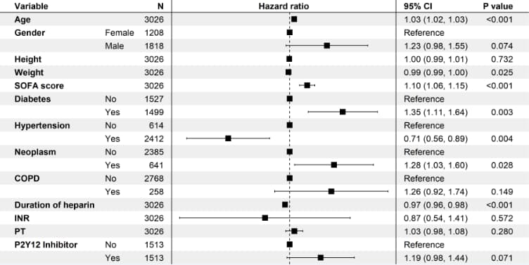
# 6 PSM样本数据,cox比例风险模型------------

data_psm_cox <- data_psm %>%
  mutate(
    # 数据准备和解释
    gender = factor(gender, levels = c("F", "M"), labels = c("Female", "Male")),
    co_diabetes = factor(co_diabetes, levels = c(0, 1), labels = c("No", "Yes")),
    co_hypertension = factor(co_hypertension, levels = c(0, 1), labels = c("No", "Yes")),
    co_neoplasm = factor(co_neoplasm, levels = c(0, 1), labels = c("No", "Yes")),
    co_COPD = factor(co_COPD, levels = c(0, 1), labels = c("No", "Yes")),
    group = factor(group, levels = c(0, 1), labels = c("No", "Yes")),
  ) %>%
  # 变量重命名
  rename(
    "Age" = "admission_age",
    "Gender" = "gender",
    "Weight" = "weight",
    "Height" = "height_imputed",
    "SOFA score" = "sofa_score",
    "INR" = "inr",
    "PT" = "pt",
    "Diabetes" = "co_diabetes",
    "Hypertension" = "co_hypertension",
    "Neoplasm" = "co_neoplasm",
    "COPD" = "co_COPD",
    "Duration of heparin" = "duration_pres_heparin",
    "P2Y12 Inhibitor" = "group"
  )

## 6.1 30天 30days-----------
# coxph建模
cox_fit_psm_30 <- data_psm_cox %>%
  # coxph风险模型
  coxph(Surv(surv_30, status_30) ~ Age + Gender + Height + Weight + `SOFA score` + Diabetes + Hypertension + Neoplasm + COPD + `Duration of heparin` + INR + PT + `P2Y12 Inhibitor`, data = .)
# 查看结果
summary(cox_fit_psm_30)

# 森林图列表数据,格式设置
panels <- list(
  # 左边空白
  list(width = 0.03),
  # 变量,一列
  list(width = 0.1, display = ~variable, fontface = "bold", heading = "Variable"),
  # 变量取值
  list(width = 0.1, display = ~level),
  # 对应样本数
  list(width = 0.05, display = ~n, hjust = 1, heading = "N"),
  # 竖线
  list(width = 0.03, item = "vline", hjust = 0.5),
  # 森林图
  list(
    width = 0.50, item = "forest", hjust = 0.5, heading = "Hazard ratio", linetype = "dashed",
    line_x = 0
  ),
  # 竖线
  list(width = 0.03, item = "vline", hjust = 0.5),
  # HR值
  list(width = 0.15, heading = "95% CI", display = ~ ifelse(reference, "Reference", sprintf(
    "%0.2f (%0.2f, %0.2f)",
    trans(estimate), trans(conf.low), trans(conf.high)
  )), display_na = NA),
  # p值
  list(
    width = 0.05,
    display = ~ ifelse(reference, "", format.pval(p.value, digits = 1, eps = 0.001)),
    display_na = NA, hjust = 1, heading = "P value"
  ),
  # 右侧空白
  list(width = 0.03)
)

# 森林图
coxplot_psm_30 <- forest_model(
  cox_fit_psm_30,
  format_options = forest_model_format_options(
    point_size = 4
  ),
  panels = panels,
  theme = theme_void()
)
coxplot_psm_30

# 保存为tiff图片
tiff(filename = "coxplot_psm_30.tiff", width = 12, height = 6, res = 300, units = "in", compression = "lzw")
coxplot_psm_30
dev.off()

coxplot_psm_30$data %>%
  write_csv(file = "cox_result_psm_30.csv")
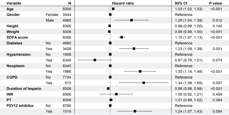
# 7 原样本数据,cox比例风险模型------------

# 数据准备
cox_data_total <- final_data %>%
  mutate(
    gender = factor(gender, levels = c("F", "M"), labels = c("Female", "Male")),
    co_diabetes = factor(co_diabetes, levels = c(0, 1), labels = c("No", "Yes")),
    co_hypertension = factor(co_hypertension, levels = c(0, 1), labels = c("No", "Yes")),
    co_neoplasm = factor(co_neoplasm, levels = c(0, 1), labels = c("No", "Yes")),
    co_COPD = factor(co_COPD, levels = c(0, 1), labels = c("No", "Yes")),
    group = factor(group, levels = c(0, 1), labels = c("No", "Yes")),
  ) %>%
  rename(
    "Age" = "admission_age",
    "Gender" = "gender",
    "Weight" = "weight",
    "Height" = "height_imputed",
    "SOFA score" = "sofa_score",
    "INR" = "inr",
    "PT" = "pt",
    "Diabetes" = "co_diabetes",
    "Hypertension" = "co_hypertension",
    "Neoplasm" = "co_neoplasm",
    "COPD" = "co_COPD",
    "Duration of heparin" = "duration_pres_heparin",
    "P2Y12 Inhibitor" = "group"
  )

## 7.1 30天 30days-----------
# coxph建模
cox_fit_total_30 <- cox_data_total %>%
  # coxph风险模型
  coxph(Surv(surv_30, status_30) ~ Age + Gender + Height + Weight + `SOFA score` + Diabetes + Hypertension + Neoplasm + COPD + `Duration of heparin` + INR + PT + `P2Y12 Inhibitor`, data = .)
# 查看结果
summary(cox_fit_total_30)


# 森林图列表数据,格式设置
panels <- list(
  # 左边空白
  list(width = 0.03),
  # 变量,一列
  list(width = 0.1, display = ~variable, fontface = "bold", heading = "Variable"),
  # 变量取值
  list(width = 0.1, display = ~level),
  # 对应样本数
  list(width = 0.05, display = ~n, hjust = 1, heading = "N"),
  # 竖线
  list(width = 0.03, item = "vline", hjust = 0.5),
  # 森林图
  list(
    width = 0.50, item = "forest", hjust = 0.5, heading = "Hazard ratio", linetype = "dashed",
    line_x = 0
  ),
  # 竖线
  list(width = 0.03, item = "vline", hjust = 0.5),
  # HR值
  list(width = 0.15, heading = "95% CI", display = ~ ifelse(reference, "Reference", sprintf(
    "%0.2f (%0.2f, %0.2f)",
    trans(estimate), trans(conf.low), trans(conf.high)
  )), display_na = NA),
  # p值
  list(
    width = 0.05,
    display = ~ ifelse(reference, "", format.pval(p.value, digits = 1, eps = 0.001)),
    display_na = NA, hjust = 1, heading = "P value"
  ),
  # 右侧空白
  list(width = 0.03)
)

# 森林图
coxplot_total_30 <- forest_model(
  cox_fit_total_30,
  format_options = forest_model_format_options(
    point_size = 4
  ),
  panels = panels,
  theme = theme_void()
)
coxplot_total_30

# 保存为tiff图片
tiff(filename = "coxplot_total_30.tiff", width = 12, height = 6, res = 300, units = "in", compression = "lzw")
coxplot_total_30
dev.off()

coxplot_total_30$data %>% write_csv(file = "cox_result_total_30.csv")
# 8 RCS限制性立方样条图------------
# RCS适用于暴露因子为连续变量,即数字类型。分类变量并不适用。

# 安装库,已安装则自动跳过
if(!require("smoothHR")) install.packages("smoothHR")
if(!require("survival")) install.packages("survival")
if(!require("Hmisc")) install.packages("Hmisc")
if(!require("ggrcs")) install.packages("ggrcs")
if(!require("rms")) install.packages("rms")
if(!require("ggplot2")) install.packages("ggplot2")
if(!require("scales")) install.packages("scales")
if(!require("cowplot")) install.packages("cowplot")

# 加载库
library(smoothHR)
library(survival)
library(Hmisc)
library(ggrcs)
library(rms)
library(ggplot2)
library(scales)
library(cowplot)


load("data_3.Rdata")

# 数据准备
rcs_data_total <- cox_data_total %>% select(Age , Gender , Height , Weight ,
                                            sofa_score = `SOFA score` , Diabetes , Hypertension ,
                                            Neoplasm , COPD , `Duration of heparin` , INR , PT ,
                                            P2Y12 = `P2Y12 Inhibitor`, surv_30, status_30)

dd <- datadist(rcs_data_total)
options(datadist='dd')


## 8.1 coxph建模-----------
fit <- cph(Surv(surv_30, status_30)~  rcs(sofa_score,4) + Age + Gender + Height + Weight  + Diabetes + Hypertension + Neoplasm + COPD  + INR + PT + P2Y12, data=rcs_data_total, x=TRUE,y=TRUE)
summary(fit)

# PH 检验
cox.zph(fit, "rank")
#可视化等比例假定
ggcoxzph(cox.zph(fit, "rank"))
#非线性检验
anova(fit)


# 结果数据
Pre0 <-rms::Predict(fit,sofa_score,fun=exp,type="predictions",ref.zero=TRUE,conf.int = 0.95,digits=2);
# 格式转化,画直方图需要
Pre0 <- as.data.frame(Pre0)
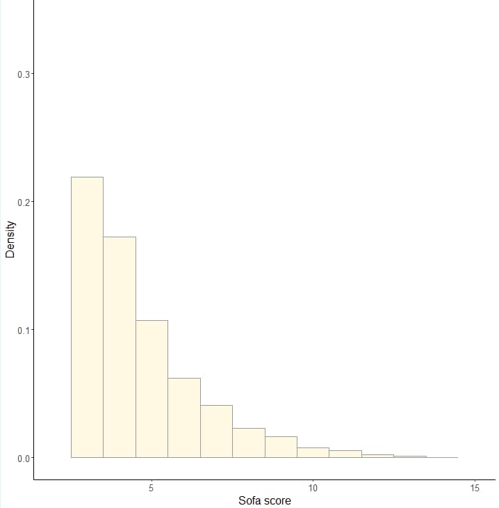
## 8.2 直方图---------
ggplot(rcs_data_total,aes(x=sofa_score))+
  geom_histogram(aes(x=sofa_score,y=..density..),alpha=0.8,binwidth = 1, fill="cornsilk",colour="grey60")+
  # 经典图形格式
  theme_classic()+
  # 坐标设置
  labs(x="Sofa score", y="Density")+
  # 设置字体大小
  theme(text = element_text(size = 15))+
  # x轴刻度,5到20,刻度间隔5
  scale_x_continuous(limits = c(2, 15),breaks = seq(5,20,5))
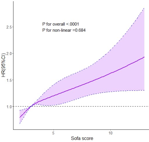
## 8.3 RCS图--------------
ggplot(Pre0,aes(x=sofa_score))+
  # 画线
  geom_line(data=Pre0, aes(sofa_score,yhat),linetype='solid',size=1,alpha = 1,colour="purple")+
  # 阴影
  geom_ribbon(data=Pre0, aes(sofa_score,ymin = lower, ymax = upper),linetype='dashed', alpha = 0.2,fill="purple",colour="blue")+
  # 画一条横线HR=1
  geom_hline(yintercept=1, linetype=2,size=0.5)+
  # 经典图形格式
  theme_classic()+
  # 文本,P值显示
  annotate("text", x = 4, y = 2.5, label = paste0( "P for overall <.0001", "P for non-linear =0.684"), hjust=0, size=5, check_overlap=TRUE)+
  # 坐标设置
  labs(x="Sofa score", y="HR(95%CI)")+
  # 设置字体大小
  theme(text = element_text(size = 15))
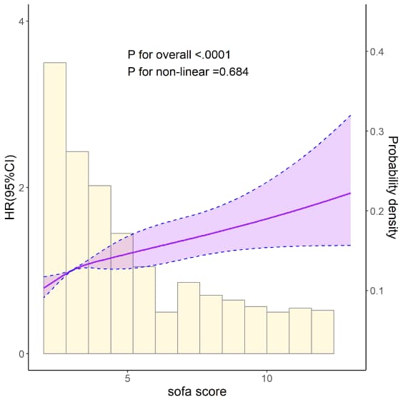
## 8.4 RCS+直方图------------
# 直方图的刻度
density<-density(rcs_data_total$sofa_score)
dmin<-as.numeric(min(density[["y"]]))
dmax<-as.numeric(max(density[["y"]]))

rcs_plot <- ggplot(rcs_data_total,aes(x=sofa_score))+
  # 直方图
  geom_histogram(aes(x=sofa_score,y=rescale(..density..,c(0,3))+0.5),alpha=0.9 ,binwidth = 0.8, fill="cornsilk",colour="grey60")+
  # 画线
  geom_line(data=Pre0, aes(sofa_score,yhat),linetype='solid',size=1,alpha = 1,colour="purple")+
  # 阴影
  geom_ribbon(data=Pre0, aes(sofa_score,ymin = lower, ymax = upper),linetype='dashed', alpha = 0.2,fill="purple",colour="blue")+
  # 经典图形格式
  theme_classic()+
  # 文本,P值显示
  annotate("text", x = 5, y = 3.5, label = paste0( "P for overall <.0001", "P for non-linear =0.684"), hjust=0, size=5, check_overlap=TRUE)+
  # 坐标设置
  labs(x="sofa score", y="HR(95%CI)")+
  # 设置字体大小
  theme(text = element_text(size = 15))+
  # x轴刻度,2到15,刻度间隔5
  scale_x_continuous(limits = c(2, 13),breaks = seq(5,20,5))+
  # y轴刻度,0到6,刻度间隔2, 设置右侧坐标轴
  scale_y_continuous(limits = c(0, 4),breaks = seq(0,6,2), sec.axis = sec_axis(~rescale(.,c(dmin,dmax)), name = "Probability density"))
rcs_plot

tiff('RCS_cox_score.tiff',height = 2000,width = 2000,res= 300)
rcs_plot
dev.off()
显示一条曲线,是因为只有Male数据。
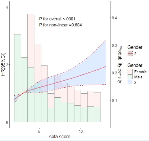
## 8.5 年龄分组RCS+直方图---------
Pre0$Gender<-as.numeric(as.factor(Pre0$Gender))
Pre0$Gender<-as.factor(Pre0$Gender)
table(Pre0$Gender, useNA = 'ifan')

# 颜色组合
col =c("red","green")

ggplot(rcs_data_total,aes(x=sofa_score,group=Gender,fill=Gender,col=Gender))+
  # 直方图
  geom_histogram(aes(x=sofa_score,y=rescale(..density..,c(0,3))+0.5),alpha=0.1, binwidth = 0.8,colour="grey60")+
  scale_colour_manual(values=col)+
  # 画线
  geom_line(data=Pre0, aes(sofa_score,yhat),linetype='solid', size=1,alpha = 0.5)+
  # 阴影
  geom_ribbon(data=Pre0, aes(sofa_score,ymin = lower, ymax = upper), linetype='dashed', alpha = 0.2)+
  scale_colour_manual(values=col)+
  # 经典图形格式
  theme_classic()+
  # 文本,P值显示
  annotate("text", x = 5, y = 3.5, label = paste0( "P for overall <.0001", "P for non-linear =0.684"), hjust=0, size=5, check_overlap=TRUE)+
  # 坐标设置
  labs(x="sofa score", y="HR(95%CI)")+
  # 设置字体大小
  theme(text = element_text(size = 15))+
  scale_colour_manual(values=col)+
  # x轴刻度,2到15,刻度间隔5
  scale_x_continuous(limits = c(2, 13),breaks = seq(5,20,5))+
  # y轴刻度,0到6,刻度间隔2, 设置右侧坐标轴
  scale_y_continuous(limits = c(0, 4),breaks = seq(0,6,2), sec.axis = sec_axis(~rescale(.,c(dmin,dmax)), name = "Probability density"))
## 8.6 第2种方式:基于ggrcs包绘制RCS--------- # RCS+直方图(正态分布时) rcs_plot2 <- ggrcs(data=rcs_data_total,fit=fit,x="sofa_score", xlab = 'score', ylab = 'HR(95%CI)', title = '') # RCS+密度曲线(非正态分布时) ggrcs(data=rcs_data_total,fit=fit,x="sofa_score", pdensity=T, xlab = 'score', ylab = 'HR(95%CI)', title = '') # X轴刻度 ggrcs(data=rcs_data_total,fit=fit,x="sofa_score",breaks = 3, xlab = 'score', ylab = 'HR(95%CI)', title = '') # X轴的总长度限制 ggrcs(data=rcs_data_total,fit=fit,x="sofa_score",breaks= 5,limits = c(0,20), xlab = 'score', ylab = 'HR(95%CI)', title = '') # 查看字体 font_families() # RCS+分组 singlercs(data=rcs_data_total,fit=fit,x="sofa_score",group="Gender",fontfamily="Times New Roman",fontsize=15 , xlab = 'score', ylab = 'HR(95%CI)', title = '') rcs_plot2 tiff('RCS_cox_score2.tiff',height = 2000,width = 2000,res= 300) rcs_plot2 dev.off()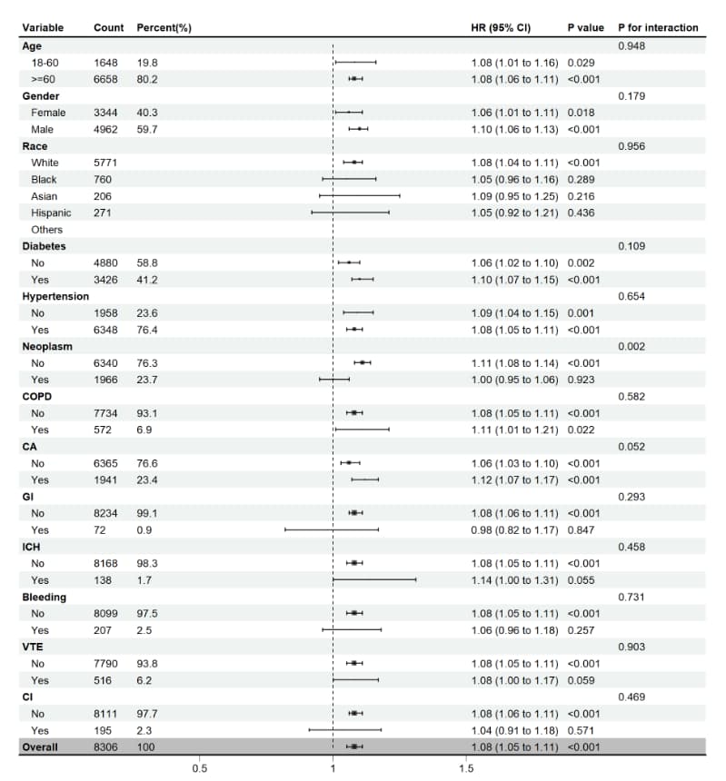
# 设置代码目录 setwd(code_path) getwd load("data_4.Rdata") if(!require(jstable)) install.packages('jstable') if(!require(forestploter)) install.packages('forestploter') if(!require(grid)) install.packages('grid') if(!require(showtext)) install.packages('showtext') library(jstable) # 于亚组分析 library(forestploter) # 绘制森林图 library(grid) library(showtext) # 数据准备 ds <- final_data %>% mutate( gender = factor(gender, levels = c("F", "M"), labels = c("Female", "Male")), co_diabetes = factor(co_diabetes, levels = c(0, 1), labels = c("No", "Yes")), co_hypertension = factor(co_hypertension, levels = c(0, 1), labels = c("No", "Yes")), co_neoplasm = factor(co_neoplasm, levels = c(0, 1), labels = c("No", "Yes")), co_COPD = factor(co_COPD, levels = c(0, 1), labels = c("No", "Yes")), co_CA_surgery = factor(co_CA_surgery, levels = c(0, 1), labels = c("No", "Yes")), co_GI = factor(co_GI, levels = c(0, 1), labels = c("No", "Yes")), co_ICH = factor(co_ICH, levels = c(0, 1), labels = c("No", "Yes")), co_bleeding = factor(co_bleeding, levels = c(0, 1), labels = c("No", "Yes")), co_VTE = factor(co_VTE, levels = c(0, 1), labels = c("No", "Yes")), co_CI = factor(co_CI, levels = c(0, 1), labels = c("No", "Yes")), group = factor(group, levels = c(0, 1), labels = c("No", "Yes")), ) %>% rename( "age" = "admission_age", "Gender" = "gender", "Race" = "race", "Weight" = "weight", "Height" = "height_imputed", "INR" = "inr", "PT" = "pt", "Diabetes" = "co_diabetes", "Hypertension" = "co_hypertension", "Neoplasm" = "co_neoplasm", "COPD" = "co_COPD", "CA" = "co_CA_surgery", "GI" = "co_GI", "ICH" = "co_ICH", "Bleeding" = "co_bleeding", "VTE" = "co_VTE", "CI" = "co_CI" ) str(ds) # Age2 ds$Age[ds$age>=18 & ds$age<60] ='18-60' ds$Age[ds$age>=60] ='>=60' ds$Age <- factor(ds$Age, levels = c('18-60', '>=60')) table(ds$Age,useNA = 'ifan') cox_sub_plot <- TableSubgroupMultiCox(formula = Surv(surv_90 , status_90) ~ sofa_score, var_subgroups = c("Age", "Gender", "Race","Diabetes", "Hypertension", "Neoplasm", "COPD","CA", "GI","ICH", "Bleeding","VTE", "CI"), data = ds) cox_sub_plot %>% write.csv(file="cox_sub_plot.csv") # Count/Percent/P value/P for interaction,4列的空值设为空格 cox_sub_plot[, c(2, 3, 7, 8)][is.na(cox_sub_plot[, c(2, 3, 7, 8)])] <- " " # 添加空白列,用于存放森林图的图形部分 cox_sub_plot$` ` <- paste(rep(" ", nrow(cox_sub_plot)), collapse = " ") # Count/Point Estimate/Lower/Upper, 3列数据转换为数值型 cox_sub_plot[, c(2,4,5,6)] <- apply(cox_sub_plot[, c(2,4,5,6)], 2, as.numeric) # 计算HR (95% CI),以便显示在图形中 cox_sub_plot$"HR (95% CI)" <- ifelse(is.na(cox_sub_plot$"Point Estimate"), "", sprintf("%.2f (%.2f to %.2f)", cox_sub_plot$"Point Estimate", cox_sub_plot$Lower, cox_sub_plot$Upper)) # 中间圆点的大小,与Count关联,数值型 cox_sub_plot$se <- as.numeric(ifelse(is.na(cox_sub_plot$Count), " ", round(cox_sub_plot$Count / 1500, 4))) # Count列的空值设为空格 cox_sub_plot[, c(2)][is.na(cox_sub_plot[, c(2)])] <- " " # 第一行Overall放在最后显示 cox_sub_plot <- rbind(cox_sub_plot[-1,],cox_sub_plot[1,]) # Percent列重命名,加上% cox_sub_plot <- rename(cox_sub_plot, 'Percent(%)' = Percent) str(cox_sub_plot) # 森林图的格式设置 tm <- forest_theme(base_size = 10, ci_pch = 15, #ci_col = "#762a83", ci_col = "black", ci_fill = "black", ci_alpha = 0.8, ci_lty = 1, ci_lwd = 1.5, ci_Theight = 0.2, refline_lwd = 1, refline_lty = "dashed", refline_col = "grey20", vertline_lwd = -0.1, vertline_lty = "dashed", vertline_col = "red", summary_fill = "blue", summary_col = "#4575b4", footnote_cex = 0.6, footnote_fontface = "italic", footnote_col = "grey20") # 森林图绘制 plot_sub <- forest( #选择需要用于绘图的列:Variable/Count/Percent/空白列/HR(95%CI)/P value/P for interaction data = cox_sub_plot[, c(1, 2, 3, 9, 10, 7, 8)], lower = cox_sub_plot$Lower, #置信区间下限 upper = cox_sub_plot$Upper, #置信区间上限 est = cox_sub_plot$`Point Estimate`, #点估计值 sizes = cox_sub_plot$se*0.1, ci_column = 4, #点估计对应的列 ref_line = 1, #设置参考线位置 xlim = c(0.5, 1.5), # x轴的范围 ticks_at = c(0.5,1,1.5), theme = tm ) plot_sub plot_sub <- plot_sub %>% # 指定行加粗 edit_plot(row = c(1,4,7,13,16,19,22,25,28,31,34,37,40,43),col=c(1),gp = gpar(fontface = "bold")) %>% # 最上侧画横线 add_border(part = c("header")) %>% # 最下侧画横线 add_border(row=43) %>% # 最后一行灰色背景 edit_plot(row = 43, which = "background", gp = gpar(fill = "grey")) plot_sub # 第一种方式:保存为图片 tiff('plot_sub.tiff',height = 2200,width = 2000,res= 200) plot_sub dev.off() # 第二种方式 ggsave("plot_sub2.tiff", device='tiff', units = "cm", width = 30, height = 30, plot_sub) # 保存数据 save.image(file = "data_5.Rdata", compress = TRUE)(1)学习资料补充,详见学习资料包。更多论文数据提取和分析的代码,详见学习资料包的Day4扩展资料。
中文翻译的d_icd_cn文件,csv直接导入。
(2)课程资料包括[DAY1]SCI论文复现全部代码-基于R、PostgreSql/Navicat等软件、SQL常用命令与批处理脚本、讲义;[Day2]MIMIC IV常见数据提取代码-基于sql、数据清洗-基于R讲义;[Day3] 复现论文、复现代码、复现数据、学习资料、讲义[Day4]扩展学习资料和相关源码等。关注公众号“熊大学习社”,回复“mimic01”,获取全部4天MIMIC复现课程资料链接。
(3)医学公共数据数据库学习训练营已开班,论文指导精英班学员可获取推荐审稿人信息,欢迎咨询课程助理!

(4)数据提取和数据分析定制,具体扫码咨询课程助理。